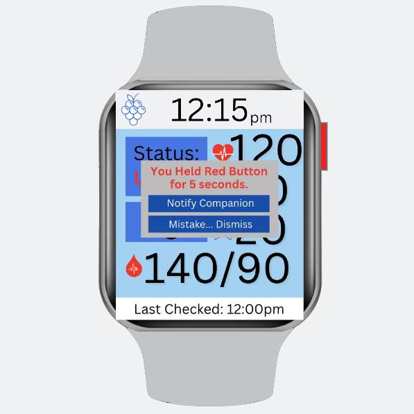
Elderly Healthcare Device and App Re-Design
IXD 450 Interaction Design Studio: Healthcare Wearables
Problem Solution: Various types of apps and wearables are used in the Healthcare Industry. While some may be very advanced with high-technology features, they may not afford populations with less technology experience. A wearable and app re-design was built on the premise that a companion and health care providers could receive the data of an elderly patient to grant them more independence.
UX Principles Used: Visibility, Signifiers, Consistency, Mental Models, Simplicity, Feedback
Medium/Program: Canva, Adobe XD
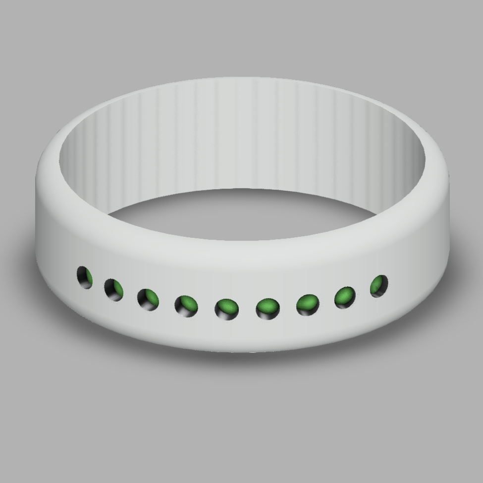
Healthcare Wearable Prototype and App Design
IXD 450 Interaction Design Studio: Healthcare Wearables
Problem Solution: Healthcare wearables come in many shapes and sizes. The location where the wearable is placed can affect the reading if it is not near a major artery and can inhibit the individual's mobility. A new healthcare wearable was created to be more convenient for the user and to display and save data on a phone or other device.
UX Principles Used: Visibility, Simplicity, Consistency, Mental Models, Feedback
Medium/Program: Canva, Adobe XD
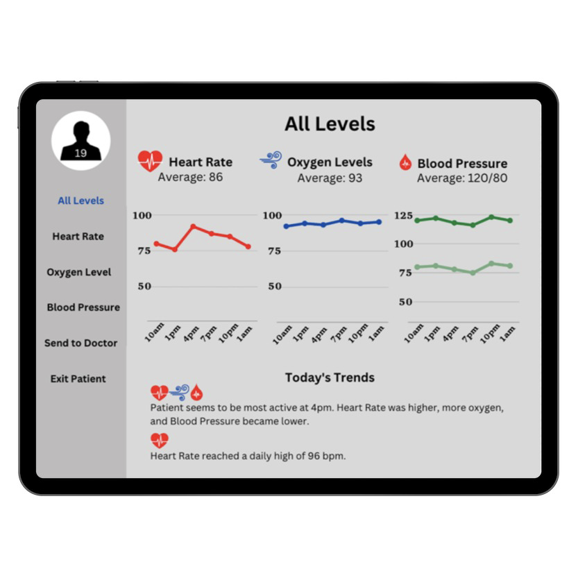
Designing for Form Factor: Health Care Devices and Data Visualozation
IXD 450 Interaction Design Studio: Healthcare Wearables
Problem Solution: Devices with interfaces come in various sizes ranging from a small apple watch to a large PC. When thinking about healthcare data, the visualization of said data may need to be changed based on the constraint of the size of the device. A healthcare platform was designed for the wearable user (an Apple Watch) and healthcare professionals (on iPad or Desktop) and illustrated ways to display data on those various devices.
UX Principles Used: Visibility, Simplicity, Consistency, Mental Models, Feedback
Medium/Program: Canva, Adobe XD
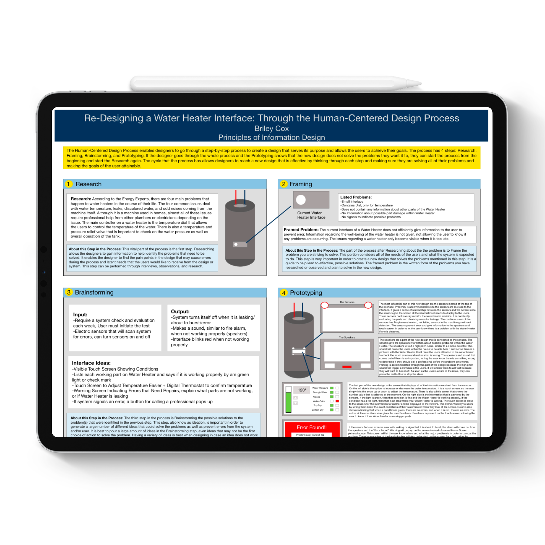
Water Heater Interface Re-Design
DCOM 130 Principles of Information Design
Problem Solution: Water Heaters have various issues that occur over time where the users are not adequately signified until it is too late. A re-design of the interface of the water heater was done to let the users know and be able to require proper checks of the device to make sure it is working correctly.
UX Principles Used: Proximity, Forgiveness, Priming, Visibility, Feedback
Medium/Program: Adobe XD
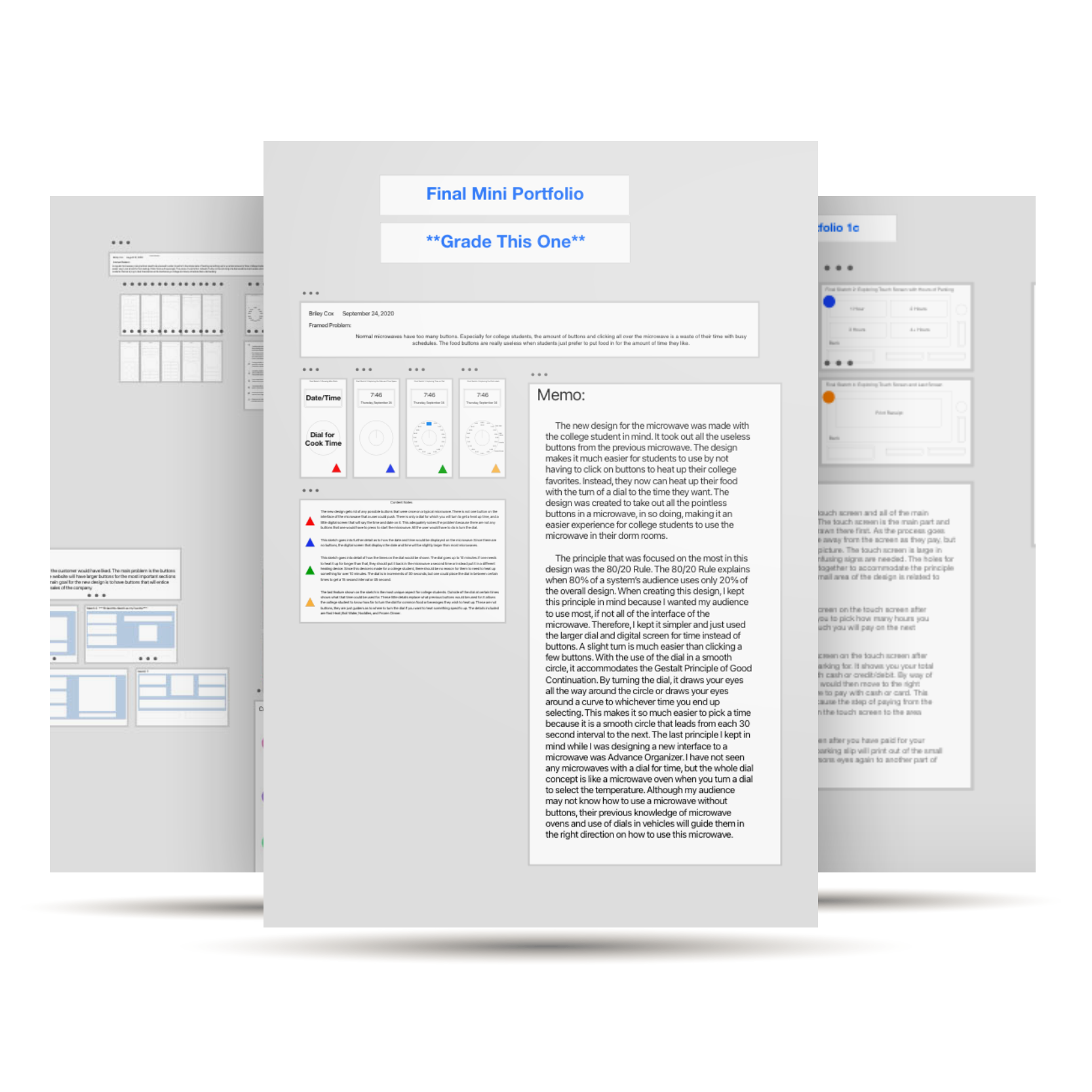
Mini Portfolio 1 Final: Microwave Interface Re-Design
DCOM 130 Principles of Information Design
Problem Solution: The re-design of the microwave interface was designed for use in college dorms. The many buttons on a standard microwave interface were adjusted to make it simpler for college students to use and to afford the limited amount of uses for a microwave in a college dorm. The re-design was made with a dial that allows college students to turn to a time they want. The useless buttons that create more noise were eliminated for a simple-to-use dial.
UX Principles Used: 80/20 Rule, Gestalt Principle of Good Continuation, Advance Organizer
Medium/Program: Adobe XD
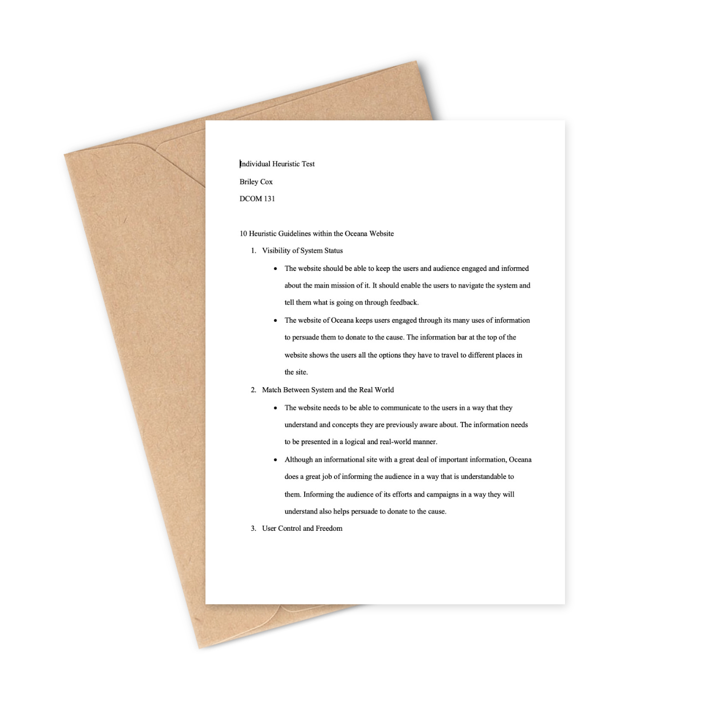
Heuristic Analysis of Oceana Website
DCOM 131 Usability Design and Testing
Problem Solution: When looking at the nonprofit website, Oceana, the site must have the proper heuristics for users to use mental models and find the information they are looking for. A heuristic analysis was performed to analyze what Oceana could improve upon to have users be more informed and driven to donate.
Group Project: As part of this project, I did an individual heuristic analysis and how I thought Oceana touched on each Heuristic explained in Barnum's book Usability Testing Essentials. My group and I brought all of our heuristics together and made an analysis of the website found in the report. (Group Members: Breana Leonard and Lindsey Mousch)
UX Principles Used: Mental Models, Consistency, Recognition over Recall, Errors
Medium/Program: Microsoft Word, Oceana Website, Usability Testing Essentials (Carol M. Barnum)
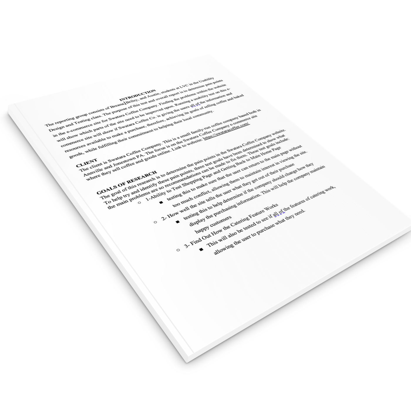
Swatara Coffee Company E-Commerce Site Usability Report
DCOM 131 Usability Design and Testing
Problem Solution: A usability test was performed on the Swatara Coffee Company website. Participants were given three tasks to perform while testing certain aspects of the website. Problems were found in the areas of navigation and their catering webpage. Recommendations were made to have a more visible navigation bar to reduce the use of the browser back arrow and a catering menu that is not external to the Swatara main website.
Group Project: As part of this project, I moderated two tests out of the five and aided in the target market section of the website, the feedback, and the recommendations for the site to improve upon as a whole. (Group Members: Breana Leonard and Austin Smith)
UX Principles Used: Visibility, Signifiers, Consistency
Medium/Program: Microsoft Word, Swatara Coffee Company Website, Usability Testing Essentials (Carol M. Barnum)